The store will not work correctly when cookies are disabled.
MENU
01
Our Logo & Brand Mark
The Sparex logo is used universally on all of our communications. You can use our logo to promote your business in affiliation with Sparex, providing you do not misuse or modify it.
Our brand mark is a shorter version and should only be used when space does not allow for the full logo. Please ensure that you are using the correct, up to date logo.
Logo
Print min. height 25mm / Digital min. height 50px
Brand Mark
Print min. height 5mm / Digital min. height 20px
Clear Space
Clear space around our logo and brand mark is equal to the cap height of the 'S'.
Usage Guidance
The examples shown here identify misuses of the Sparex logo and brand mark. This includes removing elements, warping/stretching and changing the colours.
Our primary logo and brand mark is available with white text for use on dark backgrounds and with black text for use on white or light backgrounds.
If the coloured versions of our logo and brand mark are not suitable we have single colour versions available – the use of these should be rare and every attempt should be made to use our primary logo and brand mark.
Logo & Brandmark Downloads
We have made our logo available in both digital and print packs that are here for you to download. In these packs you will find full and single versions of our logo and brand mark in a variety of formats.
Before using our logo please familiarize yourself with our brand guidelines.
Our CMYK logo set is for standard print use. We recommend using our logo on gloss paper stock to maintain the vibrancy of our brand colours. The logo set is only to be used for printed materials, this includes but is not limited to brochures, flyers and posters.
Our Pantone logo set is to be used for projects where you are specifying a Pantone / spot colour. This logo set can be used for various print projects including packaging and flyers.
Over the years our Sparex Orange has become synonymous with our brand. We are proud wavers of the orange flag but also note the difficulties of colour matching on varying materials and screens. We have created the following guidelines to ensure the Sparex colour palette is consistent no matter where it is used.
Primary Colour Palette
Three colours make up our primary palette. Sparex Black is our most dominant colour and we use it alongside Sparex Grey to ensure our content is clear and easy to digest.
Sparex Orange is used to highlight key pieces of information and to reinforce the Sparex brand.
Where possible we recommend using Pantones to ensure our colours are consistent across all touch points. Where this is not possible we would advise printing on gloss paper stock.
Sparex Black
Hex
#333333
RGB
51 51 51
CMYK
69 60 56 66
Pantone
Black 7c
Sparex Orange
Hex
#E9620C
RGB
249 121 16
CMYK
0 63 100 0
Pantone
151c
Sparex Grey
Hex
#EBEBEB
RGB
235 235 235
CMYK
0 0 0 8
Pantone
Cool Gray 1c
Secondary Colour Palette
Five colours make up the secondary colour palette for Sparex. Tints of these colours can be used as long as the integrity of the colour is maintained. These colours should be used sparingly.
Hex
#33cc99
RGB
51 204 153
CMYK
71 0 58 0
Pantone
339c
Hex
#FCB040
RGB
252 176 64
CMYK
0 35 84 0
Pantone
143c
Hex
#DB114A
RGB
219 17 74
CMYK
8 100 65 1
Pantone
192c
Hex
#D9D61F
RGB
217 214 31
CMYK
19 5 100 0
Pantone
7744c
Hex
#044568
RGB
40 4 69
CMYK
100 73 36 22
Pantone
302c
Examples of secondary colour palette use
03
Typography & Guide
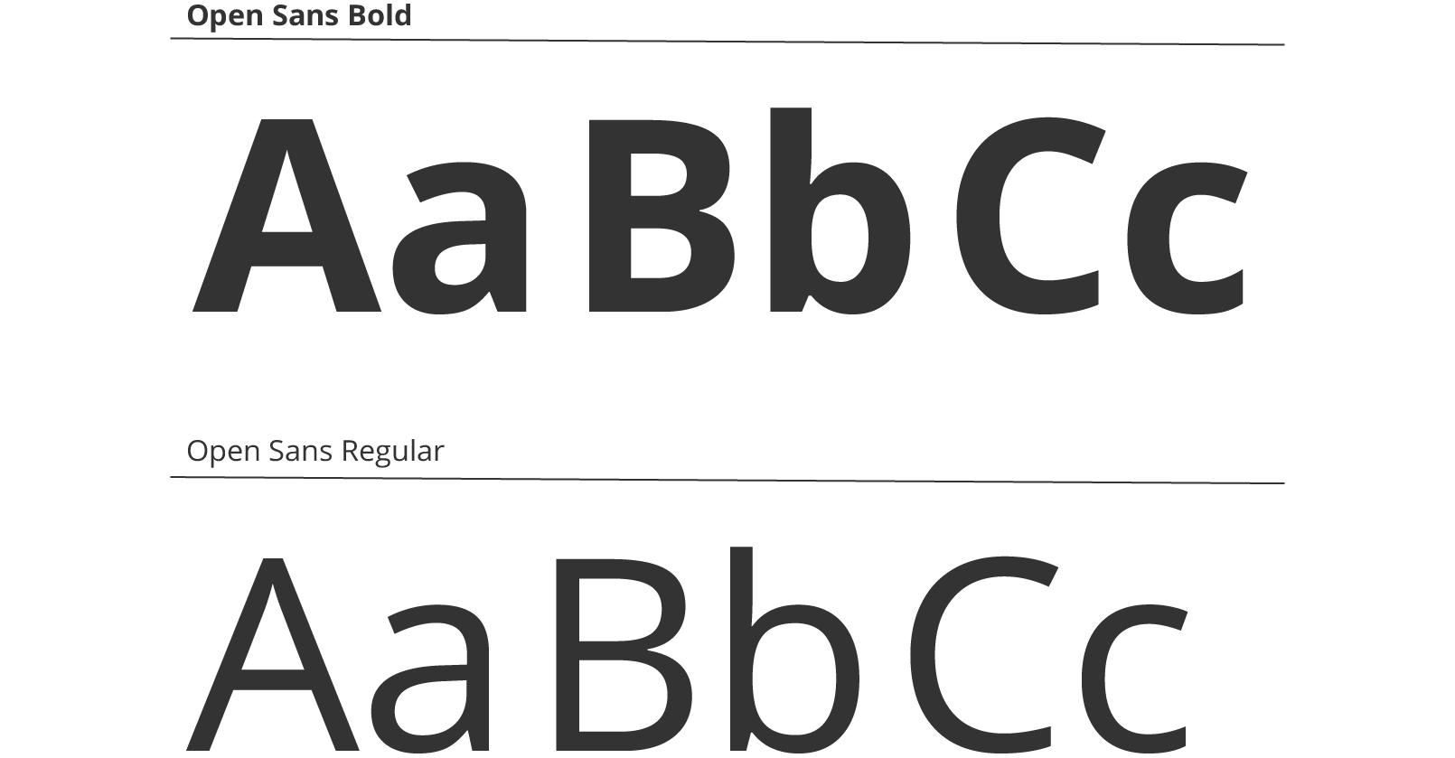
The Sparex font is Open Sans. We have selected this as a familiar and accessible font both onscreen and in print. Please refer to the following guidance when creating Sparex branded content to ensure consistency across all channels.
As a general rule headings should be in bold with 0 tracking and 115% leading. Sub headings should be in regular, ½ the point size of the heading with 0 tracking and 125% leading whilst body copy should also be in regular but ¼ the point size of the heading. Body copy should also have 0 tracking and 125% leading.
Coloured typography should be avoided. Sparex Black or white should be used with italic and condensed versions of the font only being used on rare occasions, if at all.
We recommend body copy should never be below 8pt and legal copy should always be 6pt or smaller.
We understand there may be instances where this scale does not work, as long as you stick to the clear typographic hierarchy outlined this is also ok.
The Sparex 'X' has become a key element in our design work. It can be used as a decorative bullet point or even turned into a background for brochures. Below you will find some examples of how you can use the Sparex 'X' as well as some useful downloads.
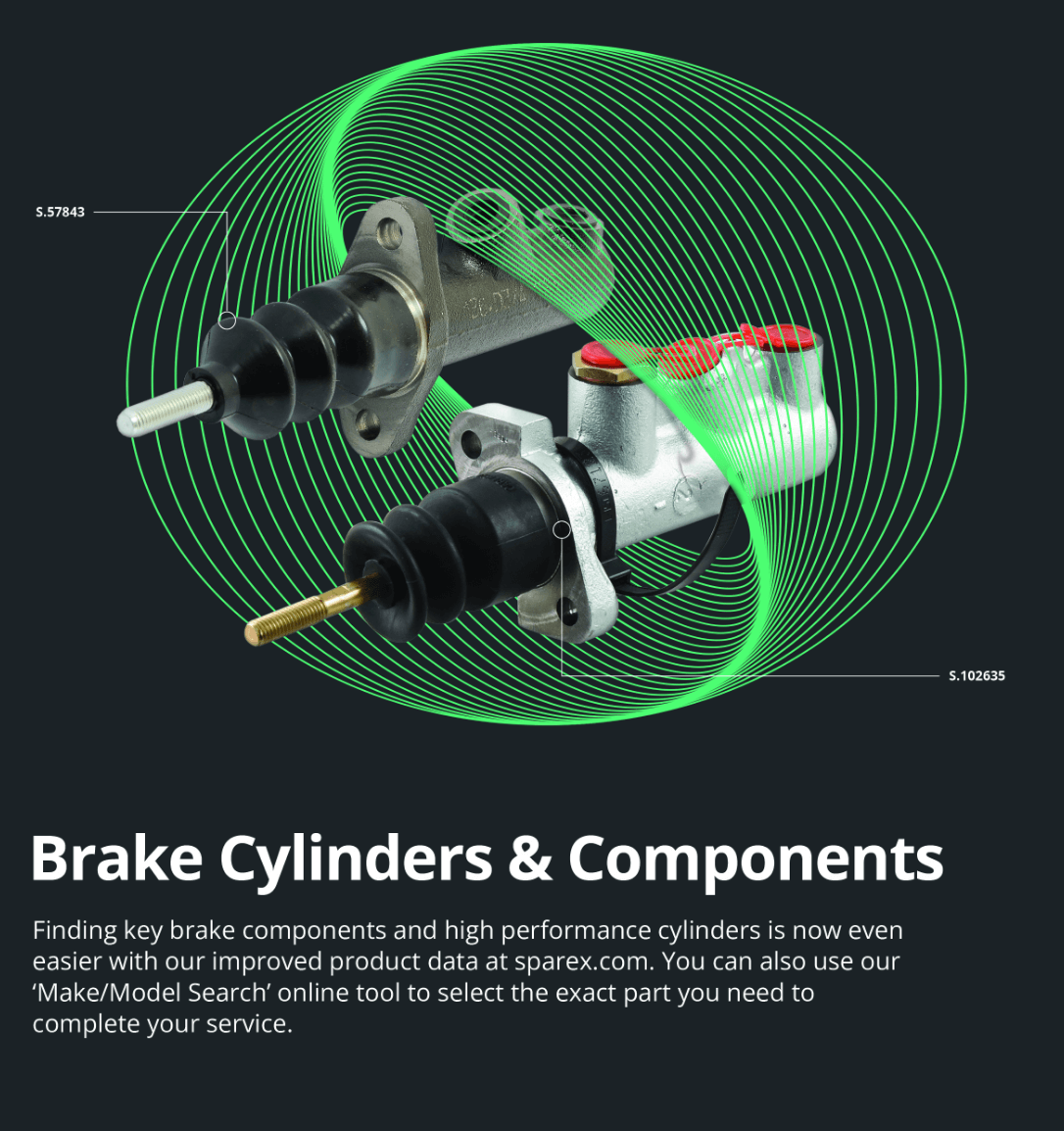
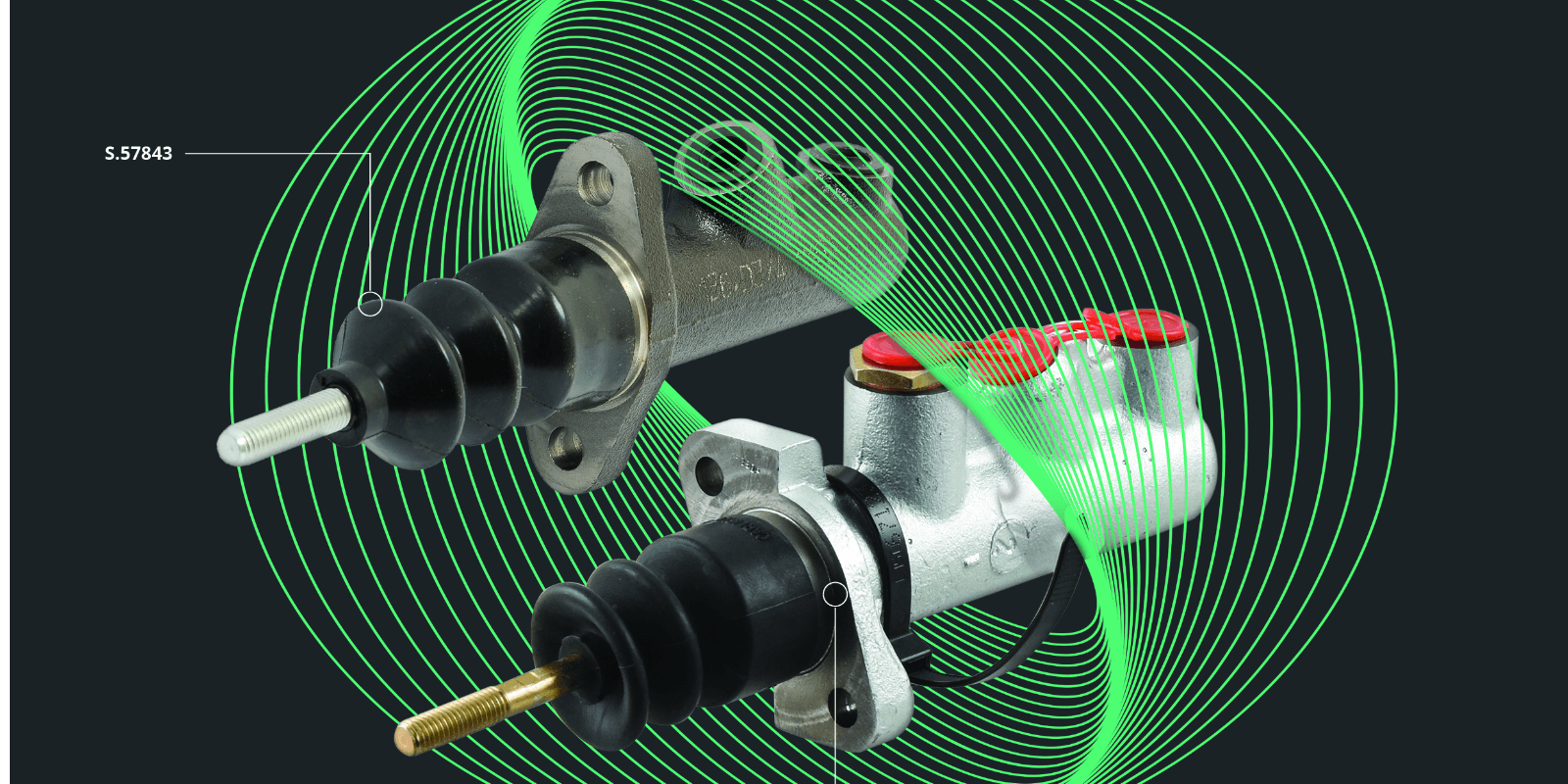
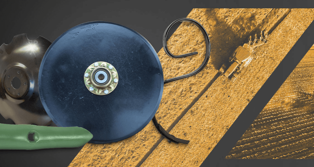
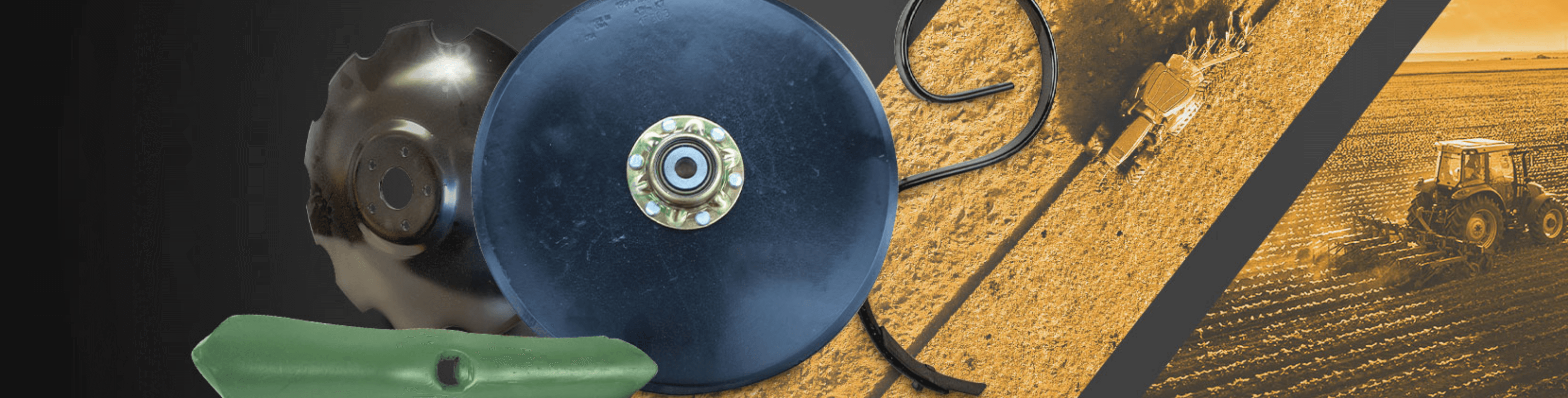
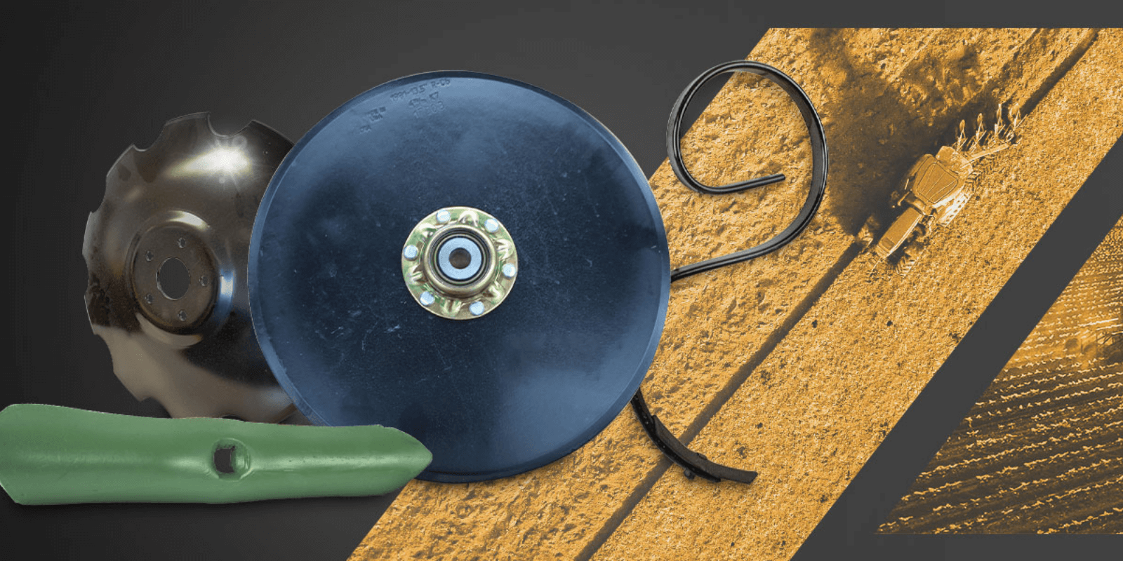
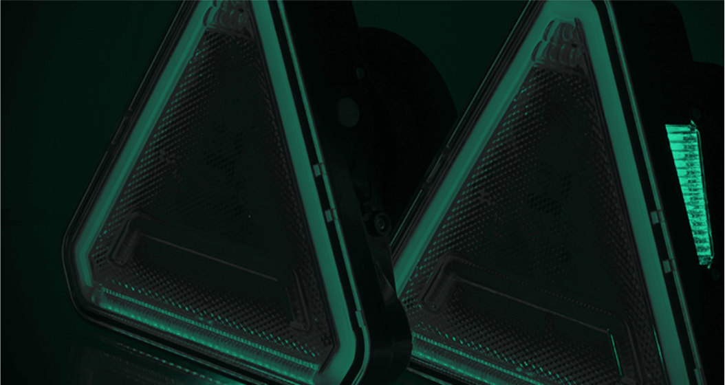
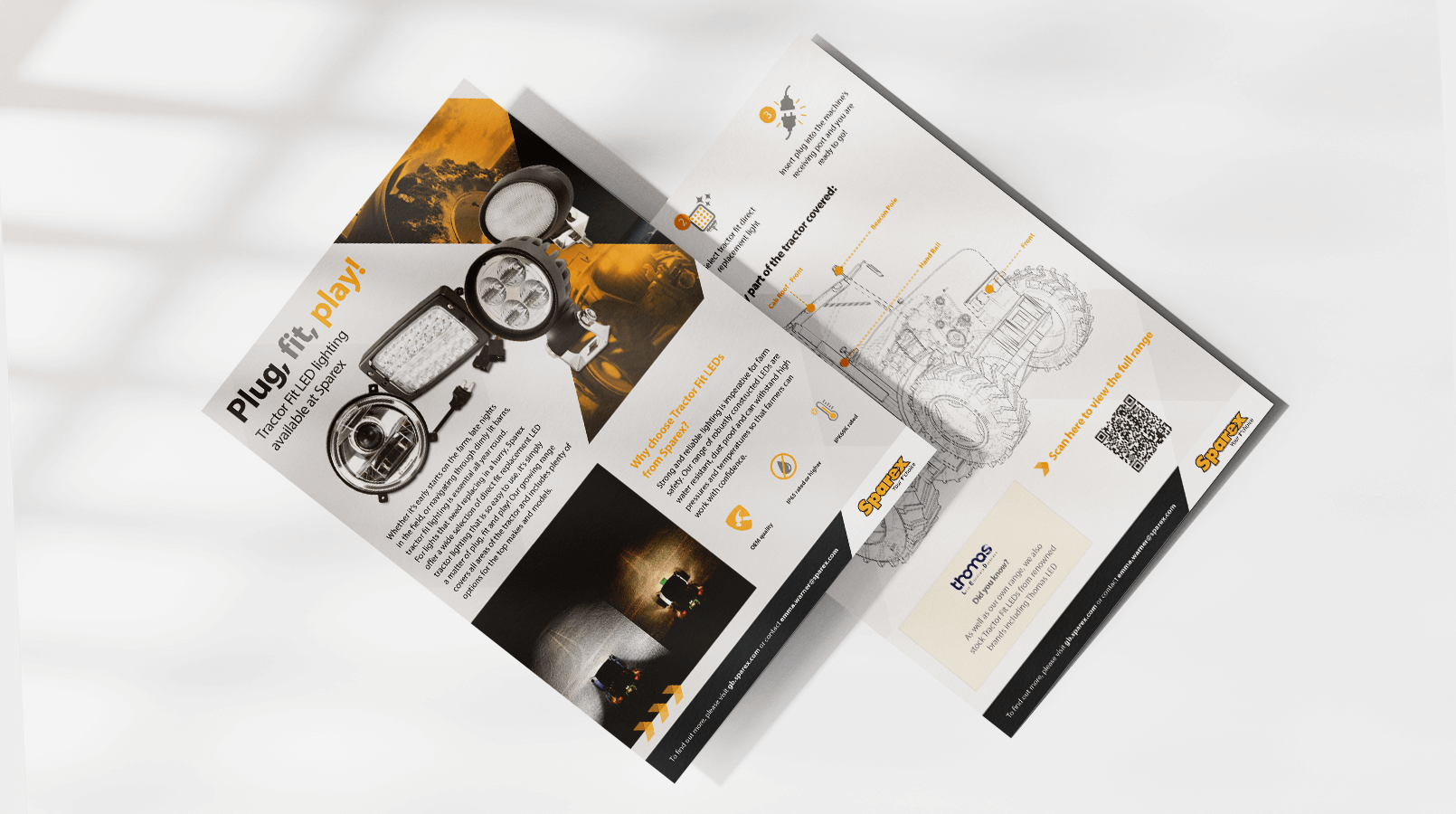
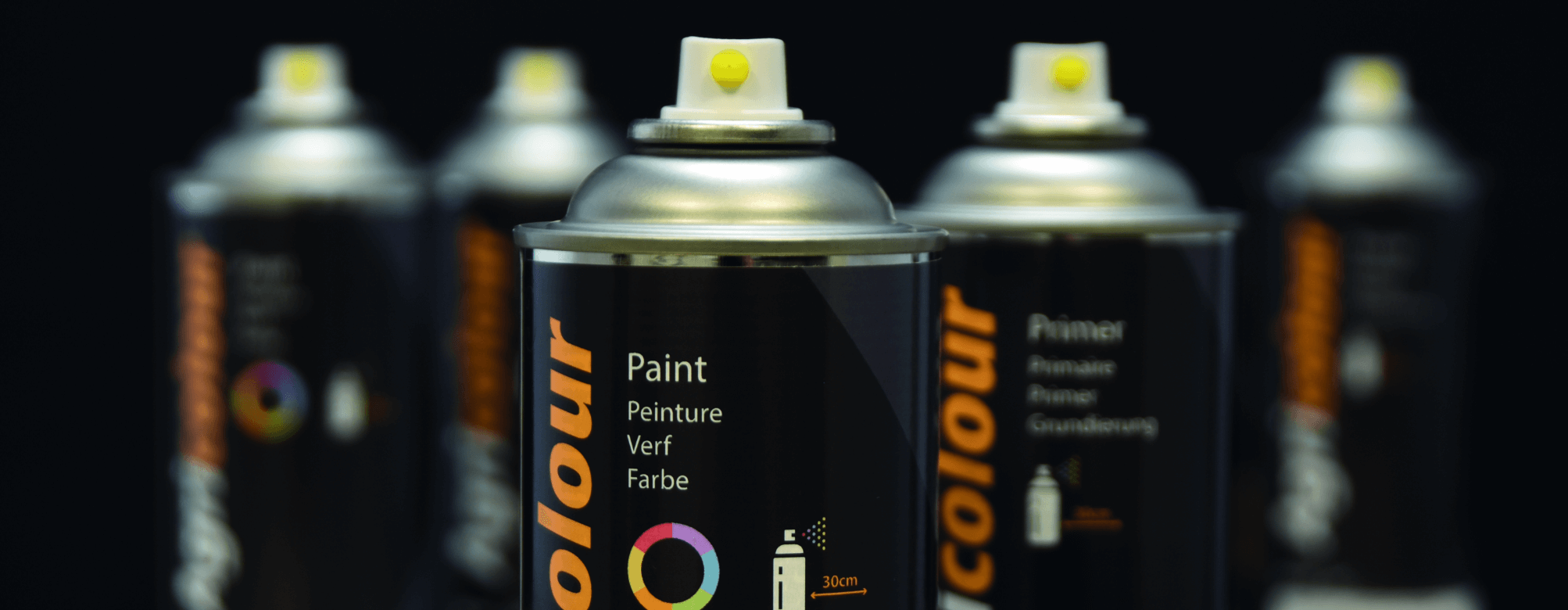
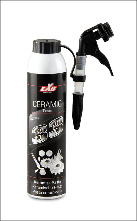
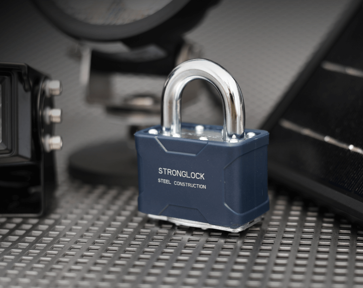
First impressions are really important and we understand that our customers gage a lot from our product photography online and in print. The various elements that make a great product image are outlined in the section below.
Our photography is clean and sophisticated. Products are shot at varying angles with clean lighting and smooth contrast.
Products should be shot on white backgrounds, avoiding harsh shadows and dark backgrounds unless a brief specifies otherwise for a highly stylised campaign.
Our photographers and videographers should push the boundaries of product imagery, playing with the depth of field and lighting techniques to bring a dynamic range to the photography. Angles of photos should be dramatic and visually interesting. Shadows and reflections should be added to product photography to avoid the look of products floating on a page.